Nick Celotto
  • Home
  • Projects
Home Projects

Data Analytics

Projects

End-to-end analytical work — the problem, the process, and what it produced.

Tableau SQL Excel

NYC Rental Market
Dashboard

Analyzing NYC rental market trends from 2015 to 2026 — uncovering the full impact of COVID-19 on long-term rent levels using Zillow data, PostgreSQL, and Tableau.

View on Tableau Public → GitHub Repo
+52.9% Total rent growth from 2015 to 2026
+16.5% Single-year jump in 2022 — largest on record
+27.6% Post-COVID premium vs pre-COVID average
Live Dashboard Interactive — hover, filter, and explore directly below
The Full Story

The Problem

NYC rent data is publicly available but rarely analyzed in a way that tells a coherent story. The Zillow ZORI dataset comes as a wide-format CSV with 139 columns — one per month — making trends invisible without transformation. The goal was to clean, reshape, and analyze the data end-to-end to answer one question: what actually happened to NYC rents before, during, and after COVID?

The Approach

I used Python to unpivot the raw Zillow data from wide to long format and classify each month into one of three periods: Pre-COVID, COVID, and Post-COVID. I loaded the cleaned data into PostgreSQL and wrote five SQL queries using window functions — including LAG() for year-over-year change and a trailing 12-month rolling average using ROWS BETWEEN. The findings were then visualized in Tableau with four KPI cards and three charts.

What It Found

The COVID rent dip was real but short-lived — rents fell 2.3% in 2020 and bottomed out in mid-2021. What followed was extraordinary: 2022 saw a 16.5% single-year jump, the largest in the dataset by a wide margin. By February 2026 the average NYC metro rent reached $3,258 — 52.9% above 2015 levels. The market stabilized at this new elevated level, with post-COVID rents averaging 27.6% above pre-COVID.

"Rents didn't just spike after COVID — they stabilized at a permanently higher level. That's the real story."
↗ NYC rents rose 52.9% from 2015 to 2026 — from $2,153 to $3,258/month
↗ 2022 saw a +16.5% single-year jump — the largest in the dataset — as post-COVID demand surged back
↗ The COVID dip was temporary — rents fully recovered within 18 months and never looked back
↗ Post-COVID average rent is 27.6% higher than pre-COVID — a permanent structural shift in the market
Tableau · PostgreSQL · Python · Excel Zillow ZORI · 2015–2026 Live
Python SQL Excel

Global Travel Analysis Dashboard

View on GitHub →
Global Travel Analysis Dashboard

The Problem

Travel is one of the largest discretionary expenses people make, yet most travelers have little insight into where their money actually goes or how their spending compares across destinations and trip types. This project analyzes 65 trips across 6 continents to uncover patterns in travel costs, budget accuracy, and satisfaction — asking the question: what actually makes a trip worth the money?

Approach

Built the dataset from scratch using Python with realistic cost structures by region, traveler type, and season. Cleaned and validated the data in pandas, then loaded it into PostgreSQL for deeper querying. Built an interactive Excel dashboard with pivot tables, a dynamic slicer, and 5 KPI cards that update when filtering by traveler type.

Key Findings

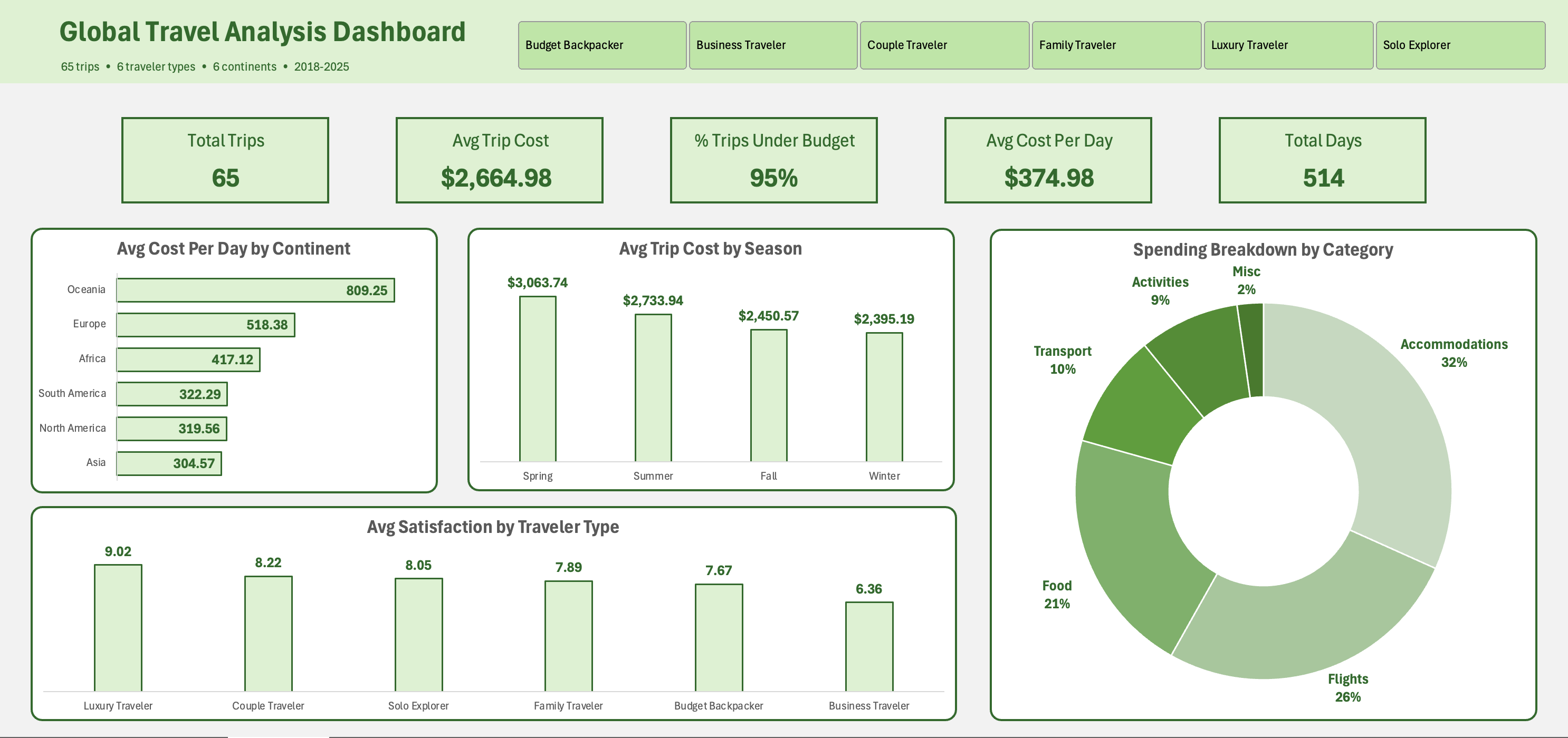
  • Oceania is the most expensive continent at $809/day — nearly 3× the cost of Asia ($305/day), the most affordable.
  • 95% of trips came in under budget — travelers consistently overestimate what they'll spend.
  • Higher spend does not guarantee higher satisfaction — correlation between total cost and satisfaction score is only 0.26.
  • Accommodation and flights consume 58% of every trip on average; food accounts for 21%.
  • Spring is the most expensive season to travel — winter offers 22% better value.

Impact

A reusable analytical framework for evaluating travel value — showing that budget travelers in Asia achieve satisfaction scores nearly as high as luxury travelers at a fraction of the cost, and that the season of travel has a larger effect on price than the destination type.

ToolsPython, pandas, PostgreSQL, Excel
DatasetGenerated — 65 trips, 27 fields, 6 traveler types
TechniquesData generation, EDA, SQL aggregations, pivot tables, dynamic dashboard
StatusComplete

Nick Celotto

© 2026 · nickcelotto.com

LinkedIn GitHub Tableau